
How can we get more users to complete our form more often, without cluttering the interface?
A redesigned multi-step form.
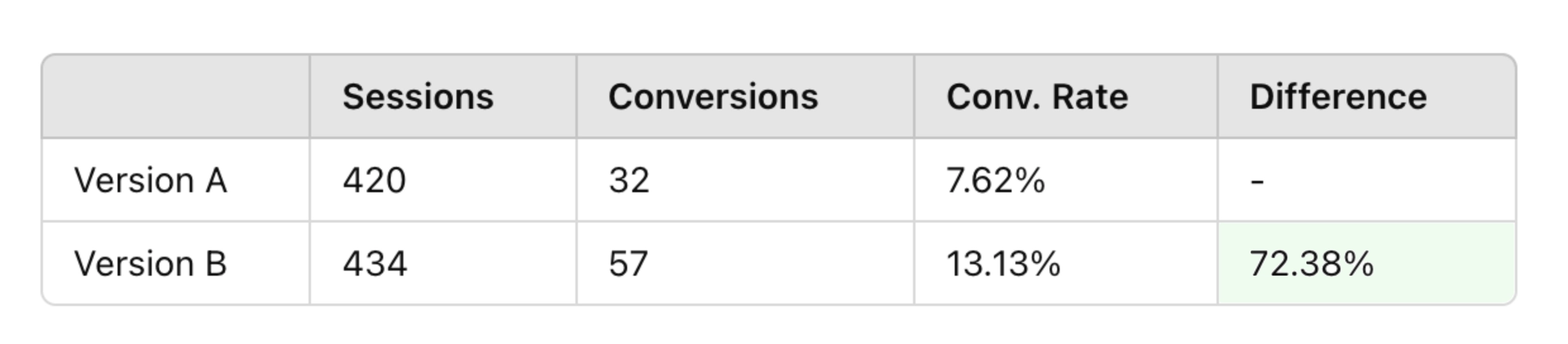
A 72.38% conversion rate increase for form submissions.

It's funny how something as simple as a form on a website can make or break a business. In this case, one of our home-services clients had a form on their website that was underperforming, in a big way. The form, which was located on almost every page of the site, was the main way for potential customers to reach out to the business and schedule a service.
The form was simple enough, with fields for your name, email, phone number, and the service being requested. But, despite its visibility, it wasn't generating many conversions. After reviewing the website’s analytics and a few dozen user recordings, I found that the form was being clicked on relatively frequently (37 times a day on average), but only a small percentage of those clicks (20% at most) resulted in a completed form submission.

In addition to these low conversion rates, I also noticed a few other issues with the form:
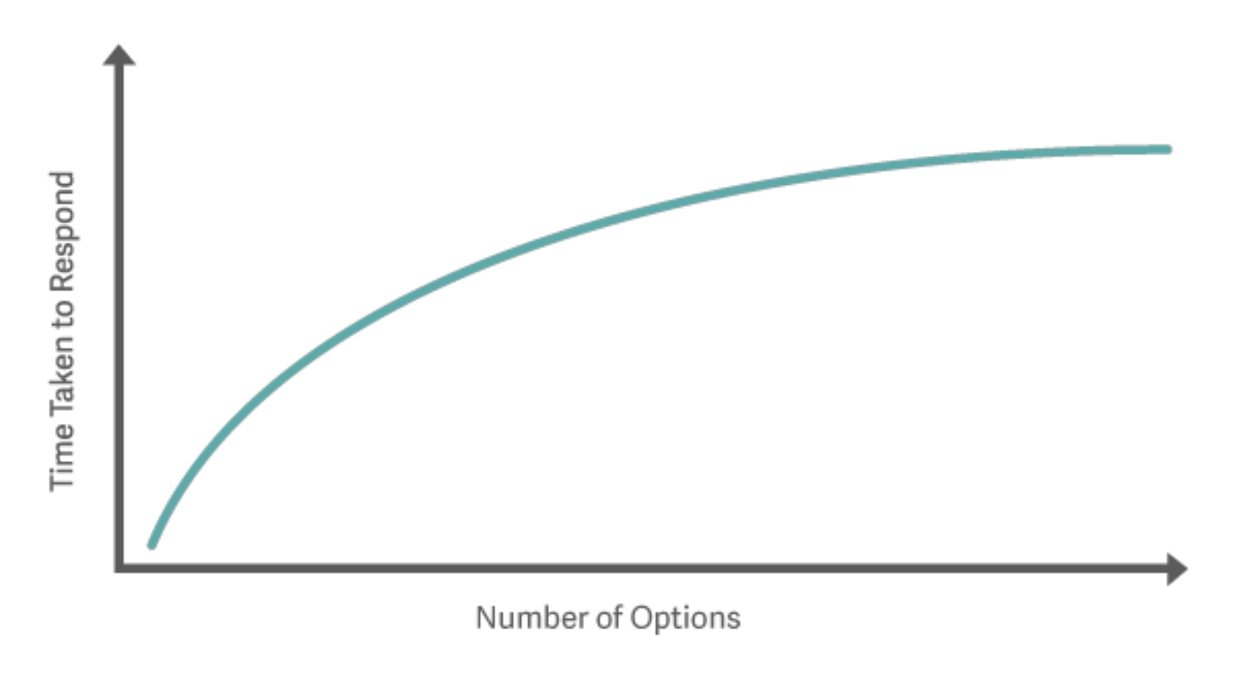
It occurred to me that the form would likely benefit from a few key changes, many of which could be implemented by following Hick's Law—the idea that the more choices we have, the longer it takes to make a decision. I hypothesized that by making the form simpler to use and more engaging, we could dramatically improve conversion rates without adding more to the interface.
Based on these insights, I redesigned the form with the following changes:
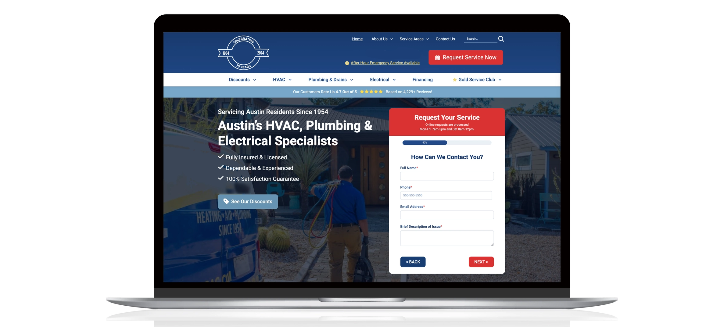
1. A four-step process:
First, I divided the form into four different steps, each with a smaller set of fields. I felt this would make it less overwhelming for users and increase the chances of them completing the form.
2. A progress bar:
Next, I added a progress bar showing users how far along they were in the form, giving them some indication of how much more they had to fill out before they were finished.
3. A CTA for each step:
By using low barrier-to-entry questions at the top and a call-to-action button at the bottom of each step, I felt users would be more likely to start and continue the form to completion.
4. Clear labels and instructions:
Finally, I made sure that all labels and instructions were clear and easy to understand, so users would not have to spend extra time trying to figure out what was being asked of them.

After creating a prototype of the redesigned form, I presented it to the client and explained the rationale behind the changes. They were impressed with the new design and quickly approved it for implementation. I then collaborated with our dev team to build the form in their existing WordPress site, using GravityForms and custom CSS to match the design of the prototype.
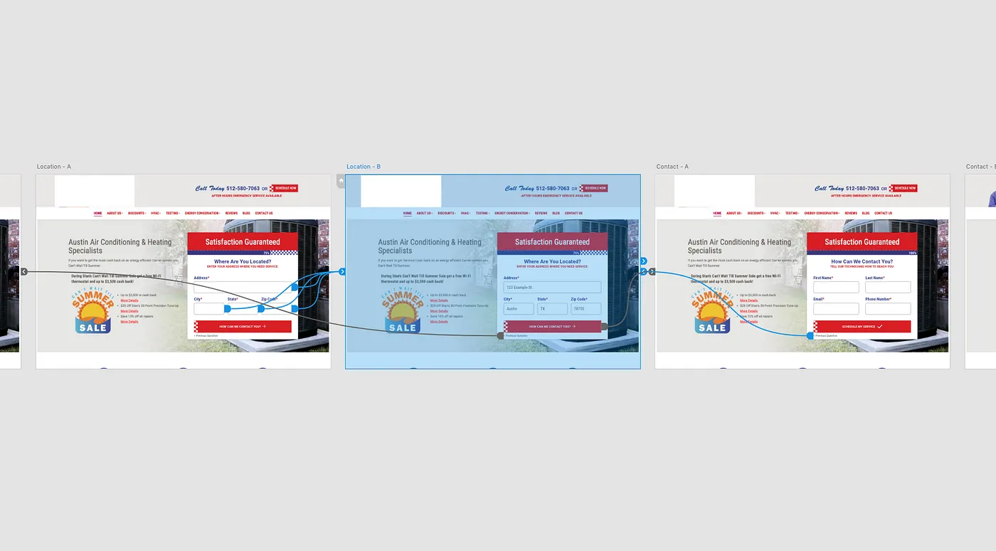
After the form was built, I set up an A/B test to compare the performance of the old vs new form designs. By showing 50% of website visitors the old form and 50% the new form, I was able to gather data on which form design was more effective at generating conversions.

The A/B test ran for a total of 14 days, during which it collected a sample size of 854 sessions split between the control group (version A) and the variant group with the multi-step form (version B).
After two weeks of testing, the multi-step form showed a 72.38% higher conversion rate than the original form, increasing from 7.62% to 13.13%, and reached a statistically significant result with 95% confidence.
This was a really fun project to take on. In addition to seeing the phenomenal results of the completed project, I got hands-on experience applying user-experience concepts to a real-world marketing problem and using A/B testing to drive data-driven decisions. As one might expect, my client was also ecstatic about the results and had nothing but positive feedback for the new form design.


